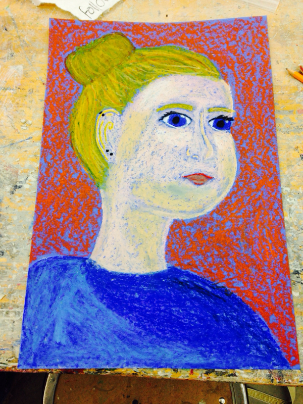
This piece is a expressive self portrait, I used pinks and whites to create my face and yellow, greens, and browns, to color my hair into a bun. I also used different shades of blue to create my shirt and a basic orange for the background. One skill I learned is to use the lightest colors first and shade out from those so that I don't smudge the wrong colors together. Like for example, underneath my lips, there's a bit of a blue streak because I was creating my shirt at the same time as I was doing the really dark shading on my chin and got some blue from my fingers onto the pink. The principle most emphasized is shading of color especially throughout my hair and face. The use of shading in this piece is very important and defines my face and shows where the light is in the photo I drew off of. The skills used in this work creating something interesting because the colors can be close to someone's actual skin tone but at the same time it's not because it's different shades of pink for my face and a lot of colors of yellows, oranges, and greens in my hair.
This piece is one of my slab mugs in which I put vine designs on. The size of this mug is about equal to the middle of your palm and about 3 in tall. I learned to connect the handle properly so that during the bisque stage it doesn't fall. I believe value was most emphasized in this piece because of how the colors turned out and the difference of shade between the swirls and the actual mug. I originally wanted my mug to be blue but it accidentally got put in the bisque too early, but it still turned out cool. It specifically created something new because it is not at all what I expected my work to turn out as which in my opinion always makes it just that much more interesting. This is one of the slab pieces where we flatten it out between two pieces of paper and roll it through with either a rolling pin or Mr. Meserve's rolling machine in his classroom. Then I shaped it into a larger shape making a soup bowl kind of mug and added a bottom and a handle to it. I learned that I have to attach the handle better because I originally had a full long handle but half of it did blow off but luckily I was able to saw the bottom of the handle down so that it looks decent and isn't sharp. I think that the movement of the sides of the mug are the most emphasized. And due to the fact that this is a circular shape, the movement trend of the walls can continue on not necessarily ending. This created something new and interesting because most mugs don't have a half handle, although it does look a little bad the handle still works to hold up the mug which seems pretty cool to me. This piece is two pinch pots combined and then shaped into something that looks like a bowling pin. I then carved out a place for the eyes then placed eyes in the holes and a four sided beak underneath them. I also added wings to the side of the bird and glazed it the colors of a penguin as well. I learned that scoring and slipping is really important because the wings started to separate away from the body but luckily still stayed in tact. One element that was most emphasized in the work is form because the form of the head balancing on the body and how it curves and at the bottom as well I think is pretty important. This principle created a new and interesting way to form a penguin because I made sure that the head was the right size and shape and that the whole thing isn't just an egg shape with a few add on pieces of clay but an actual handcrafted curve in its body, head, and neck. May 5th, 2015 This piece is two pinch pots combined then formed into a square shape and rounded on the corners for a more interesting shape. I then created a lid shape by using a tool to trace and then cut out a specific lid that can only fit on in one way; and for the vine designs I drew those by hand. One skill I learned from this work is that the base of the pot must be quite thin and if it's too this it will explode. I believe line and form are the most emphasized in my work. The line element in this is seen as new and meaningful because I created it myself and by hand so it was a kind of spur-of-the-moment type which I find very interesting. 1) Some successes in my drawing were the ceiling and the flags for the colleges. I thought the flags were very difficult to do with the one point perspective but I feel I did pretty good on them. And with the ceiling, I thought I wasn't going to be able to do the light fixtures and it turns out I can and I feel proud of that. 2) Things that I needed to improve were the floors because I didn't quite finish so they look like wooden planks not linoleum and also the lockers because they weren't quite proportionate to the rest of the drawing. To make the floor better I would just he to finish it and to make the lockers better I would just need to make them taller and the actual lock square needs to be fixed a little too. 3) This piece is a one point perspective hallways drawing that shows the hall by the bathroom and in front of the cafeteria. One skill I learned/used in this sketch was using orthogonals and also learning to make objects proportional. I think line and form are most represented because all of it is made of lines and very definite ones too. And form was represented through the lights, lockers, and the window. The skill and the element/principle creates something interesting because it displayed how all the lines besides the horizontal/vertical lines can all be aimed into one direction with also creating a representation of the hallway. This isn't quite new or meaningful because this drawing is made by all of the class in almost the exact same way so it doesn't show much meaning. This piece is a landscape photograph that I painted, it portrays mainly space and value. One skill I learned was that the colors need to be layered from lightest shade to darkest so then the colors don't accidentally blend like they did in my sketch photo. I think the most emphasized principle of design is value because we used it to create the overall look and paint of the work. The element is creating something new, interesting, and meaningful by showing that the value scale can be represented into real life objects or ideas. The project was the self portrait drawing at a 3/4 view so that our head is turned lightly to the side. One skill used in this sketch is shading and I also learned a little about it too, like specifically where to place it on the face. The elements that are most emphasized in the work are value and proportion. Proportion is used so that all the parts of the face are equal to each to represent the drawing to look more like us. The principle is creating something interesting more so than something new, since there has been plenty of self portraits in the past. This piece is basically just an elaboration of sketches all on one sheet of paper. Not all the shapes like triangles, squares, other quadrilaterals are not visible right off that bat because the main focus is on the swirls and tunnel like things that the shapes create. I guess the skill that I used for the work would be using time wisely and repeated work carefully. One element that was majorly emphasized during this drawing is shapes, movement, and illusion. These shapes and what we designed inside of them exploited tunnel like forms when connected next to each other which was very interesting, especially when more that one type of shape was used in the basis. |